In 1826, a French engineer and mathematician named Charles Dupin produced a map of illiteracy across France. Each of the country’s administrative departments was shaded in proportion to how many of its inhabitants could not read. The darker the region, the worse the problem. He called them cartes teintées, or tinted maps. He had no name for the method. That would come over a century later, in 1938, when American geographer John Kirtland Wright combined two Greek words, choros (region) and plethos (multitude), to give the form its name: choropleth.
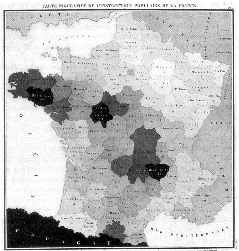
Dupin’s map was not a lone invention. He was working within a broader European statistical tradition; German statisticians had been experimenting with spatial representations of population data for decades before him. The first choropleth to group values into discrete bins, rather than Dupin’s one shade per unique value, appeared in a Prussian atlas just two years later. By 1837, Irish engineer Henry Drury Harness had produced population density maps of Ireland that advanced the form further. The choropleth is nearly two centuries old. It has been misused for most of that time. Knowing why requires understanding four structural weaknesses in the form, each of which can silently invert the story the data tells.
The Normalization Problem
Choropleth maps are now among the most widely used visualisations online, thanks to modern mapping tools like Datawrapper, Flourish, and Mapbox. The most common error is also the most consequential: using raw or absolute values instead of normalised data.
This map shows the absolute number of cattle in each Indian state. West Bengal appears at the top, followed by Uttar Pradesh and Madhya Pradesh. The northeastern states and Sikkim show the lowest counts. The data is not incorrect, but the visualisation is misleading. States with larger populations or land areas will naturally show larger cattle counts. Size is doing the work, not density or dependence on cattle.
For meaningful comparisons, the map needs relative data: cattle per 1,000 people, or cattle per square kilometre.
[Insert: Choropleth map showing cattle per 1,000 people or per square km]
This version tells a different story. Bihar and Jharkhand now stand out alongside West Bengal, states that did not register clearly on the first map. That shift is not new data. It is the same data, displayed honestly.
The same problem distorts political maps. In the 2024 Indian general election, the NDA coalition won approximately 63% of Lok Sabha seats on approximately 45% of the combined vote. A constituency-coloured choropleth shaded by winning party makes the result look visually dominant: geographically large constituencies in northern and western India cover enormous areas of the map, and the winning coalition held most of them. Vote share, the more precise measure of electoral support, tells a different story, but it rarely appears alongside the seat map.
The Large-Area Problem
Even when a choropleth uses properly normalised data, it has a structural visual weakness: geographically large regions dominate the reader’s first impression regardless.
The eye weights colour by area of ink, not by the number of people living in that area or the intensity of the phenomenon being measured. A state covering 342,000 square kilometres commands more visual attention than one covering 3,700 square kilometres, even if the smaller state has more people, a higher rate of the measured phenomenon, or a more extreme value.
This is why electoral maps have been persistently criticised. In the 2016 US presidential election, a county-level choropleth appeared overwhelmingly red. Donald Trump had won 2,649 counties to Hillary Clinton’s 503, and the map looked like a rout. He won the Electoral College 306 to 232 and lost the popular vote by approximately 2.9 million votes. The counties he won were geographically vast and sparsely populated. Mark Newman, a geographer at the University of Michigan, produced a population-scaled version of the same map that looked dramatically different, and was dramatically more informative.
India faces the same structural problem. Rajasthan, Madhya Pradesh, and Uttar Pradesh cover enormous land area. Kerala, Goa, and the northeastern states are geographically small but dense with people and often extreme in their data values. A choropleth of any per-capita indicator will tend to visually emphasise the large states and obscure the smaller ones, regardless of what the underlying numbers say.
The Colour Problem
Even with correctly normalised data, a third layer of choices shapes what a reader sees: colour.
The choice of colour palette is not an aesthetic decision. It determines what pattern a reader sees in the data.
Three types of palette exist for choropleth mapping, and selecting the wrong one is one of the most common design errors.
Sequential palettes, running from light to dark on a single hue, suit data that runs from low to high with no meaningful midpoint. Literacy rates, cattle density, and income levels belong here.
Diverging palettes, two contrasting hues meeting at a neutral midpoint, suit data that has a meaningful centre: deviation from a national average, change from a baseline, or anything measured above and below zero. Using a diverging palette on data with no meaningful midpoint creates false symmetry and implies a contrast that does not exist in the numbers.
Qualitative palettes, using unrelated hues, suit categorical data with no inherent order: party affiliation, land use type, administrative classification.
Cynthia Brewer, a geographer at Penn State, built a tool called ColorBrewer (colorbrewer2.org) in 2002 that provides 35 ready-made colour schemes organised by these three types. It flags which schemes are safe for colour-blind readers and suitable for printing, and it is integrated into R, Python, and QGIS. There is no good reason to design a choropleth without consulting it.
One palette deserves specific mention: the rainbow, or “jet,” colour scale that remains widely used in dashboards and scientific visualisations. It is perceptually non-uniform: equal steps in data do not produce equal perceived steps in colour. It creates false boundaries where the palette transitions sharply through cyan and yellow, and it is largely inaccessible to readers with colour-vision deficiency. Researchers documented these problems in 1998. A 2007 paper titled “Rainbow Color Map (Still) Considered Harmful” restated the case. The palette is still in common use.
The Boundary Problem
There is a deeper issue that even a well-normalised, correctly coloured choropleth cannot resolve: the boundaries it shades are administrative artefacts, not natural boundaries of the phenomenon being mapped.
Disease does not respect district lines. Poverty does not stop at a state border. Educational attainment varies within a district as much as it varies across districts. When these phenomena are aggregated to administrative units and choropleth-mapped, the result is a pattern shaped partly by the data and partly by how someone drew the boundary years or decades earlier.
This is known as the Modifiable Areal Unit Problem, first formally described by Stan Openshaw in 1984. The same underlying data produces visually different choropleth patterns depending on whether you aggregate to state, district, or sub-district level. An analyst selecting between available boundary systems can, consciously or not, produce almost any visual pattern from the same dataset. For readers of policy maps, the implication is direct: the pattern on the page is partly a function of the geographic unit chosen, not only the data.
Alternatives
The right response to these problems is not to abandon the choropleth, but to know when to use something else.
Cartograms resize geographic regions proportionally to the mapped variable (population, votes, GDP) rather than to land area. The result is more analytically honest for population-weighted phenomena, but cognitively demanding: readers accustomed to standard geographic maps find the distorted shapes disorienting. They work well in editorial contexts where the reader has time to adjust to the form.
Dot density maps place dots randomly within each region, one dot per unit of the mapped variable, rather than shading the entire region uniformly. They give a truer sense of how a phenomenon is spread within an area, rather than collapsing it to a regional average.
Tilegrams replace each geographic unit with an equal-sized hexagon, preserving adjacency relationships while removing the area bias entirely. An open-source tilegram of India’s 543 Lok Sabha constituencies is available on GitHub (mustafasaifee42/India-Constituencies-Tilegram), where each constituency is represented as an equal hexagon regardless of its geographic size. Al Jazeera used this approach for its 2024 India election results coverage. The result is a map that represents voters, not land.
[Insert: Bar chart of cattle count per state]
And sometimes the right answer is to not use a map at all. If the reader’s goal is to compare ranked values across regions, a bar chart is almost always clearer, more precise, and easier to read than any choropleth. Geography adds value when spatial relationships (clustering, adjacency, distance) are part of the insight. When the point is simply to compare two states on a given indicator, a bar chart with clear labels will communicate that comparison more accurately than any shaded map.
Conclusion
The choropleth is nearly two centuries old and still in daily use across newsrooms, policy reports, and government dashboards. The problem is not the form itself. The problem is that its ease of production has outrun the attention paid to its requirements: normalised data, a colour palette matched to the data type, an awareness of what administrative boundaries do and do not capture, and an honest assessment of whether a map is the right tool for the question at hand.
Used correctly, choropleths illuminate regional patterns that no other visualisation can show as efficiently. Used carelessly, they can make a party with 36% of the vote look like it controls a continent.